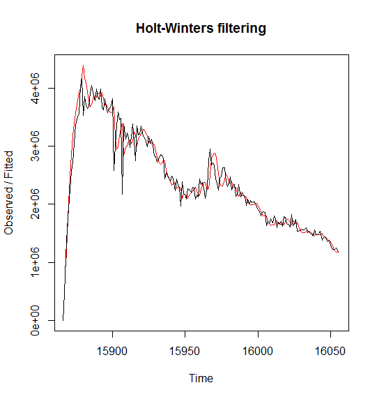
2 мӢңм°ЁмғҒкҙҖ(м„ н–ү, нӣ„н–ү) #
> tmp
   curr_val prev_val
5   3949515  4316313
6   3835690  4149917
7   3975137  4165120
8   3993659  4050347
9   3942373  3949515
10  3825807  3835690
11  3920338  3975137
12  3586568  3993659
13  3633877  3942373
14  3444306  3825807
15  3903889  3920338
16  3529384  3586568
17  3531147  3633877
18  3518490  3444306
19  3481886  3903889
20  3298512  3529384
21  3400325  3531147
22  3641914  3518490
23  3466527  3481886
24  6028886  3298512
25  6543880  3400325
26  5516709  3641914
27  5100715  3466527
28  5259752  6028886
29  5370662  6543880
30  5009019  5516709
31  4778911  5100715
32  4836214  5259752
33  4662136  5370662
tmp <- na.omit(tmp)
ccf(tmp$curr_val, tmp$prev_val)
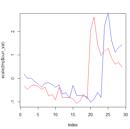
мІ« лІҲм§ё л§Өк°ңліҖмҲҳлҘј кё°мӨҖмңјлЎң м–јл§ҲлӮҳ м„ н–ү/нӣ„н–ү н•ҳлҠ”м§Җ м•Ң мҲҳ мһҲлӢӨ. к°ҖмһҘ ліјлЎқн•ҳкІҢ лӮҳмҳЁ л¶Җ분мқҙ x축м—җ -4 мқҙлӢҲк№Ң tmp$curr_valк°Җ лҢҖлһө 4мқјм •лҸ„ л№ лҘҙлӢӨ.
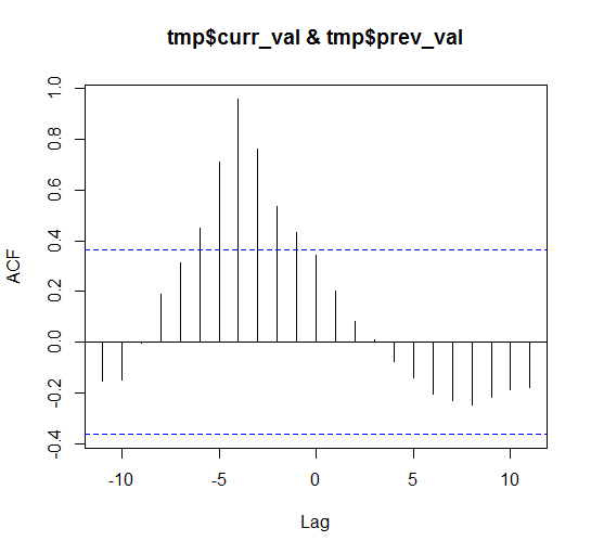
мІ« лІҲм§ё л§Өк°ңліҖмҲҳлҘј кё°мӨҖмңјлЎң м–јл§ҲлӮҳ м„ н–үн•ҳлҠ”м§Җ м•Ң мҲҳ мһҲлӢӨ.
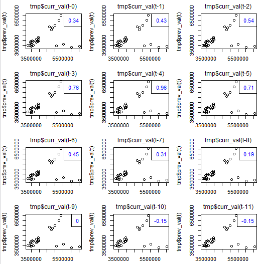
lag.plot2(
 itall.R
) н•ЁмҲҳлҘј мқҙмҡ©н•ҙм„ң м°ЁнҠёлҘј к·ёл Өліҙмһҗ.
source("http://databaser.net/moniwiki/pds/TimeSeries/itall.R")
lag.plot2(tmp$curr_val , tmp$prev_val, 11)
н‘ңмӨҖнҷ”н•ҙм„ң лқјмқё м°ЁнҠёлҘј к·ёл Өліҙмһҗ.
plot(scale(tmp$curr_val), type="l", col="red")
lines(scale(tmp$prev_val), col="blue")
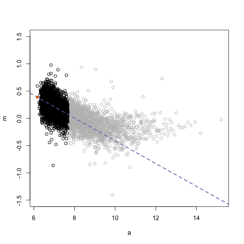
мөңлҢҖ/мөңмҶҢ көҗм°ЁмғҒкҙҖ л°Ҹ мӢңм°Ё (
![[http]](/moniwiki/imgs/http.png) м¶ңмІҳ(http://blog.naver.com/lofie21?Redirect=Log&logNo=110171809189)
м¶ңмІҳ(http://blog.naver.com/lofie21?Redirect=Log&logNo=110171809189))
max_ccf <- function(...)
{
    d <- ccf(...)
    cor <- d$acf[,,1]
    lag <- d$lag[,,1]
    dd <- data.frame(cor, lag)
    max_val <- dd[which.max(dd$cor),]
    min_val <- dd[which.min(dd$cor),]
    result <- c()
      if(abs(max_val[1]) >= abs(min_val[1])){
          result <- max_val
      } else {
          result <- min_val
      }
    return(result)
}

max_ccf <- function(...)
{
  d <- ccf(...)
  cor <- d$acf[,,1]
  lag <- d$lag[,,1]
  df <- data.frame(cor, lag)
  max_val <- df[which.max(df$cor),]
  return(max_val)
}

min_ccf <- function(...)
{
  d <- ccf(...)
  cor <- d$acf[,,1]
  lag <- d$lag[,,1]
  df <- data.frame(cor, lag)
  min_ccf <- df[which.min(df$cor),]
  return(min_ccf)
}
мҳҲлҘј л“Өм–ҙ, лӢӨмқҢкіј к°ҷмқҙ кІ°кіјк°Җ лӮҳмҷ”лӢӨл©ҙ..
> max_ccf(sales, val)
         cor lag
12 0.8932095  -1
- мөңлҢҖ мғҒкҙҖ кі„мҲҳлҠ” 0.89
- мӢң간축 мғҒм—җм„ң salesк°Җ valліҙлӢӨ -1мқј л’Өм ё мһҲмқҢмқ„ лң»н•Ё.
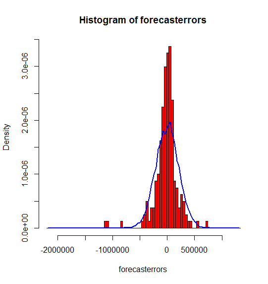
3 plotForecastErrors #
plotForecastErrors <- function(forecasterrors)
{
    # make a histogram of the forecast errors:
    mybinsize <- IQR(forecasterrors)/4
    mysd   <- sd(forecasterrors)
    mymin  <- min(forecasterrors) - mysd*5
    mymax  <- max(forecasterrors) + mysd*3
    # generate normally distributed data with mean 0 and standard deviation mysd
    mynorm <- rnorm(10000, mean=0, sd=mysd)
    mymin2 <- min(mynorm)
    mymax2 <- max(mynorm)
    if (mymin2 < mymin) { mymin <- mymin2 }
    if (mymax2 > mymax) { mymax <- mymax2 }
    # make a red histogram of the forecast errors, with the normally distributed data overlaid:
    mybins <- seq(mymin, mymax, mybinsize)
    hist(forecasterrors, col="red", freq=FALSE, breaks=mybins)
    # freq=FALSE ensures the area under the histogram = 1
    # generate normally distributed data with mean 0 and standard deviation mysd
    myhist <- hist(mynorm, plot=FALSE, breaks=mybins)
    # plot the normal curve as a blue line on top of the histogram of forecast errors:
    points(myhist$mids, myhist$density, type="l", col="blue", lwd=2)
}
p10 <- forecast(m, 10)
plotForecastErrors(p10 $residuals)
8 нҸүнҷң #
library("forecast")
data(gold)
g <- data.frame(g = na.omit(coredata(gold)))$g
y_width <- c(min(g) - min(g) * 0.05, max(g) - max(g) * 0.05)

plot(g, type="l", lty="dotted", ylim=y_width)
par(new=T)
plot(smooth(g, twiceit=T), type="l", col="blue", ylim=y_width, ylab="")
мқҙлҸҷмӨ‘к°„к°’ н•ЁмҲҳ : runmde()